Pages

Monday, 23 March 2015

Type Choices


For my type I started off by looking on DaFont for inspiration and drawing out different typefaces, editing them to give them the look that I think would best suit my card designs. After doing that I started drawing them out, seeing what it would look like in the lettering that I would be using. This helped me to further see if I liked the typefaces and get an idea how they would actually look as part of a mother's day card. I did many of the typefaces multiple times, changing them slightly each time so that I got an idea how the different changes would affect the look of the type.
I really enjoyed this task and think it helped me to get an idea for what sort of typeface I could use for my final piece, and hopefully I will be able to use one of them during the process of making my final design.

Tuesday, 17 March 2015

Emulation


Firstly I started by drawing out different ideas for the front cover of my card, taking ideas from my scamps and then inked over them to make sure the process i was doing was the same as my copy. I then scanned these in and put them into Photoshop.
After I decided I wanted to use the mugs as the main part of my design I went ahead and added one of the inked drawings into my Photoshop document. I started off my enlarging the image and using the lasso tool to tidy up the lines around the outside of the design add in parts add more depth into the parts that didn't already look how I wanted to. I also used the lasso tool to create the marshmallows as I realised that the ones I had inked didn't quite give the effect that I wanted. I went round the original marshmallows, added in the light pink colour and then duplicated it. This meant I had a few marshmallows, and so I thought it would be a good idea to make them all different sizes so that it made the mug look more realistic. I used the brush tool to add more of a dripped effect to the front of the mug, and make it look more genuine.
Then I decided to add in the two other mugs that I had inked, and did the same with them, but making sure they did not look identical. To do this i changed the positioning of the marshmallows, and added more onto one than the other two. When I had put the three mugs together in the same document I noticed that the design overall was lacking a few things and so I went about making the cream look more life-like, and adding colour into the actual mugs. Starting with the cream, I used the magic wand tool to select the section of the cream and then filled this part with a light yellow/cream colour and did this to each separate mug. When I had done that I had the idea to create the effect of chocolate sprinkles or chocolate chips. To do this I used the brush tool with a very small brush and a dark brown colour, dotting around the cream randomly to create the effect that I desired.
I also used the magic wand tool to select the mug themselves to add colour in. I decided to use analogous colours, and I chose to use blue as it is cool toned, contrasting with the pink coloured background I had chosen.
After I was happy with the actual look of the mugs themselves I decided to mess around with how they were arranged and placed on the page. When I was happy with how they were placed I noticed having them all the same size looked quite plain and simple. To change this I decided to make them all different sizes, this filled out the page much more and also made my designs look more detailed.

Looking at the background I realised that it was lacking something, and decided to find something to put behind the mugs. I searched Pinterest for something hand-drawn to keep to the theme having everything designed by hand, and found and image of lots of hearts on it and positioned it in my document. Straight away I realised that the image was much too dominant on the page and so I decided to lower the opacity of the image. I started off by lowering it to 50% but this was still too much and took away the focus from the main images on the page, so I kept lowering it until I got the effect I wanted, so the hearts were still noticeable but did not overpower the mugs.


Once I was happy with how the images and background looked I moved onto the type, so that it is clear what type of card it was. I knew I wanted the word "Mother's" to be the larger part of the type and so I first made that the main part of the text, and started to play around with the other two parts of text I had. I moved these two around to get different ideas and find out which one was the most successful. 

I finally came up with the design that I wanted for my type, and decided to make it bigger so that it stood out on the page, but like the picture background, didn't overpower the image. I think the bold script works really well with the hand-drawn and inked images.

Here is my final emulation. Overall I am very happy with how it turned out and I think that this process is one that I really enjoy and will use for my final piece.

Thursday, 12 March 2015

Copy

For my copy I decided to re-create this poster originally made by Linzie Hunter, an illustrator. I first came across her work looking on Pinterest for different styles of illustrators who i could use a different technique or process to create a piece of work.

I started by drawing out the different parts of the piece in my sketchbook and inked over them using an ink and brush. I tried to make sure I had a few different types of each one, so that I had options when putting them into Photoshop. After doing that I scanned it in and placed into Photoshop. I changed the threshold to make sure there was definite black and white in the image with nothing in-between, I also changed the brightness and contrast to ensure this.

I then started to edit the image, copying the different parts of type into an A4 document which i was using to create my final copy. I had to use the lasso tool frequently to cut parts of the text off to give it the same look as the original. For much of the lettering I ended up having to put them into separate layers so I could work on them individually, and it meant I was able to move them around more easily.
After making sure all the lettering was correct and placed in the correct place I started to change the the colour of the text. I used the magic wand tool to select each part and then went onto the original to get the right colour, then selected that colour.


This was quite a long process as I wanted to get the image just right, once I had got the text right i started to add in the small extras. Again I used the magic wand tool to change the colours and the lasso tool to edit them slightly. I used the brush tool with a really small brush to add in the effect of the small stars as dots, and i tried to do this as randomly as possible.
I added in all the extras such as the small and large stars, the line underneath "first"  and the dashes around the outside which I changed the colour of using the magic wand tool.


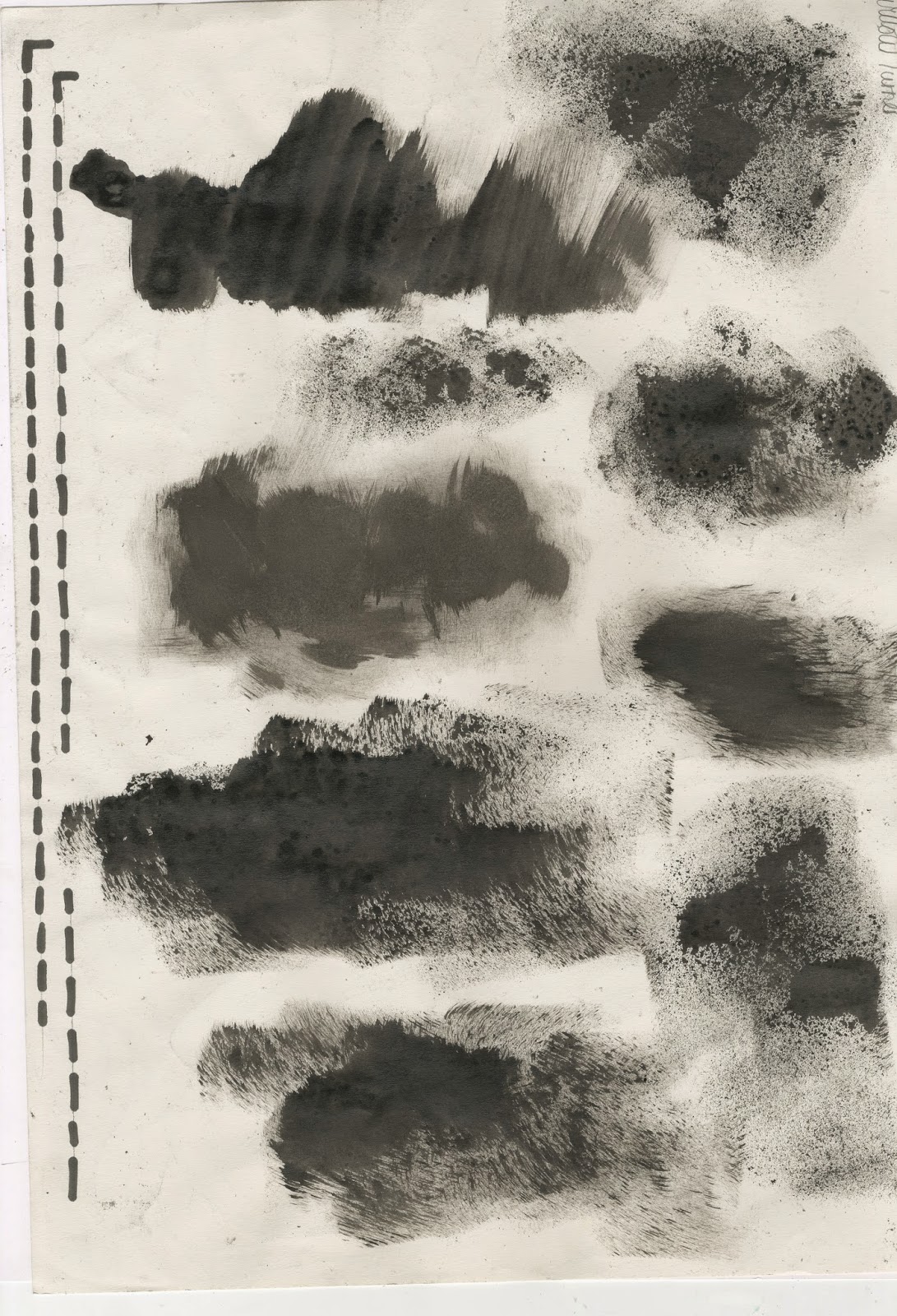
I then noticed that on the background of the image there was some sort of splodge/paint splatter, which made the image slightly lighter around the lettering of the word "DARE" and around the bottom of the image, where the small drawings were.
To start doing this i took a sponge, dipping it in ink and making different splodges and marks on the page. I also used a white board marker to create the dotted lines that went down the sides of the image.

 I then placed this into the Photoshop document and placed it behind the lettering, trying to line it up as best as I could. I went onto layer styles and added in a white colour overlay and lowered the opacity of that layer. I did this to make the splodge of ink more subtle and blend in better with the background, like the original. I then duplicated this layer, making it smaller using the transform tool, and lowering the opacity of this one much more. I then placed it at the bottom of the page, trying to place it where it was on the original one was.


 Here is my final copy. Overall I am very happy with how it turned out, although it doesn't look quite like the original. I think this new way of creating my work is something which I quite enjoyed. Having lots of different elements to a design which eventually comes together to create an eye-catching piece of work is something I realised I enjoy doing, and so I think it may carry this on throughout my work and when creating my final piece.

Tuesday, 3 March 2015

Own Scamps


Here are the scamps I have drawn to get ideas for my final piece. I took inspiration from my scamps and Pinterest, which helped me get ideas for what I would want to create.


I then decided to add in colour using my watercolours to add in slight parts of colour in some of them and then large parts of colour into other ones. I thought this helped me to develop my ideas further and get a proper idea for what I would want to use in my final design.